
Give the opening frame a job.
A logo or an attractive transition is not an opening by itself. Many people in the feed do not know your product. The first image should therefore show a situation, desire or problem the product genuinely relates to. If the point only becomes clear much later, the film has spent its scarcest time without giving viewers a reason to stay.
That does not mean every ad has to shout. A precise scene can be stronger than a dramatic claim. The opening should match the audience, the product and the destination page. Attention that turns into the wrong expectation is not useful attention.
A scene sequence from TRAVEL eSIM.
My self-initiated TRAVEL eSIM concept opens with an arrival without mobile data. It then shows preparation before departure and returns to the arrival: the phone is connected and the map is usable. The sequence turns an abstract eSIM into a recognisable travel problem with a visible answer.
This is a creative choice, not a measured campaign result. Another audience might need a different opening, such as comparing plans or facing a problem just before flying. Whatever the angle, the opening and the product demonstration should fulfil the same promise.
From a problem to a visible answer.
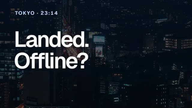
Problem
Arriving without mobile data gives the film its reason to exist.
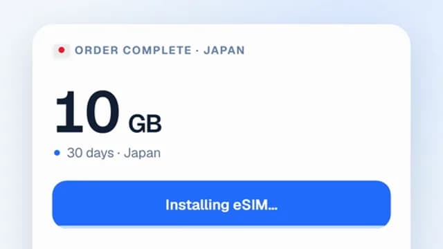
Preparation
Setup before departure shows what the product requires.
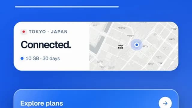
Result
Connection and a map show the benefit when it matters.
Vertical is more than a crop.
Reels and TikTok are experienced in a vertical frame. Text, product detail and the decisive action have to remain readable alongside the platform interface. I plan the format before animation; cutting a landscape film afterward can remove the moment that matters most.
Platform specifications should be checked when the film is delivered. Meta and TikTok describe 9:16 vertical placements and safe areas for important creative elements. Sound can give the film character, while the essential action should also make sense without it.
Make variants answer a question.
Three versions are useful when they let you learn something. You might compare two openings with the same demonstration, or two clear benefits with the same opening. If the image, message, audience and landing page all change at once, it becomes hard to understand what caused a different outcome.
I therefore plan reusable scenes and replaceable moments together. That can make follow-up ads or additional formats more efficient than three unrelated productions. The campaign data, not the storyboard, will show which version performs better.
The click should lead to the same story.
If an ad promises easy setup, the landing page should make that setup easy to find and understand. If the film features a specific detail, the page needs to support it. A good ad creates an expectation; the next page has to meet it.
Before production I ask about the audience, offer, placement and destination. Then we can plan the opening, product proof and next step as one sequence. No film alone can guarantee clicks or purchases; the offer, targeting and page matter too.
After watching, can someone say what problem the product solves, how the solution is shown and what happens next?
TRAVEL eSIM is a self-initiated FORMFOLGE studio concept. It has no client campaign data or measured ad results.